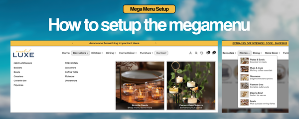
How to setup the megamenu and mobile menu in our Shopify themes
How to Set Up Desktop & Mobile Menus in Shopify (SEO Optimized)
Creating well-structured navigation menus is essential for user experience (UX) and SEO. In this guide, we will walk you through setting up both desktop and mobile menus for the Shopify theme.
Step 1: Create Two Separate Menus
To optimize the navigation structure, Shopify recommends creating two separate menus:
-
Desktop Menu (supports megamenu with three child levels)
-
Mobile Menu (supports only two child levels for easier navigation)
How to Create Menus in Shopify:
-
Log into your Shopify Admin Panel.
-
Navigate to Online Store → Navigation.
-
Click Add Menu and create:
-
"Desktop Menu" (for larger screens)
-
"Mobile Menu" (for smaller screens)
-
-
Click Save Menu after creating both.
Step 2: Structure the Desktop Megamenu
The desktop menu in the theme supports a megamenu layout. To enable it, ensure that at least three child levels exist under a parent menu item.
Steps to Structure the Desktop Megamenu:
-
Under Navigation, open the Desktop Menu.
-
Add your top-level menu items (e.g., Shop, Collections, New Arrivals, etc.).
-
Under a top-level item (e.g., Shop), create sub-menu items (Level 2).
-
Under a Level 2 item, add another set of sub-items (Level 3).
-
The theme automatically converts the dropdown to a megamenu when three levels exist.
-
Click Save Menu.
Example:
Shop
  ├── Women
  │    ├── Dresses
  │    ├── Tops
  │    ├── Bottoms
  ├── Men
  │    ├── Jackets
  │    ├── Shirts
  │    ├── Pants
Step 3: Add Images & Subtitles to the Megamenu
To enhance the megamenu visually, follow these rules:
-
To display an image on the left side of dropdown items:
-
Use the
|(pipe) character in the menu title. -
Example:
Hoodies | Image_URL
-
-
To add subtitles below menu items:
-
Use the
|(pipe) character between the main title and subtitle. -
Example:
Shoes | Trending Styles
-
Example Structure:
Shop
  ├── Women | women.jpg
  │    ├── Dresses | Elegant Styles
  │    ├── Tops | Summer Collection
Step 4: Create Headers & Separators in Dropdowns
Headers and separators help organize the dropdown and improve readability.
-
To create a header (non-clickable menu item):
-
Set the menu item’s link to
#(hash symbol). -
Example:
Shop by Category (#)
-
-
To add a horizontal separator:
-
Set the menu item’s link to
-(hyphen). -
Example:
------ (-)
-
Example:
Shop
  ├── # Women’s Fashion
  ├── Dresses
  ├── Tops
  ├── -
  ├── # Men’s Collection
  ├── Jackets
  ├── Shirts
Step 5: Add a Button to the Megamenu
You can create call-to-action (CTA) buttons inside the megamenu using specific classes.
How to Add Buttons:
-
Use the
|(pipe) character followed by a button class. -
Available classes:
-
btn-primary(main button) -
btn-light-primary(lighter version) -
btn-outline-primary(outline button) -
Replace
primarywithsecondaryfor alternative styling.
-
Example:
Best Sellers | btn-primaryStep 6: Structure the Mobile Menu
The mobile menu should be simpler than the desktop version for easy navigation.
Mobile Menu Rules:
-
Only two levels are supported (not three like desktop).
-
Avoid overcomplicating submenus to enhance user experience.
Steps to Structure the Mobile Menu:
-
Go to Online Store → Navigation.
-
Open the Mobile Menu.
-
Add top-level categories (e.g., Shop, Collections, New Arrivals).
-
Under each top-level category, add one level of sub-items only (e.g., Dresses, Tops).
-
Click Save Menu.
Example:
Shop
  ├── Women
  │    ├── Dresses
  │    ├── Tops
  ├── Men
  │    ├── Jackets
  │    ├── Shirts
Final Thoughts
By following these steps, you will create SEO-optimized and user-friendly navigation menus for the KS Millennium Shopify theme.
Desktop Menu Highlights:
-
Supports 3 levels (megamenu)
-
Allows images, subtitles, headers, and separators
-
Can feature buttons for CTAs
Mobile Menu Highlights:
-
Supports only 2 levels
-
Designed for quick, easy navigation
Need More Help?
Feel free to ask any questions! 🚀


